Throughout our midterm projects which disclosed the concept of reality vs. fantasy, I discovered a more in depth meaning to this comparison. Reality vs. Fantasy can take many forms of view and for this assignment I wanted to express my view more personally through showing my everyday experiences and to also display what would be a fantasy land if one could exist in my life. By viewing this art I want the observer to get to know me through my reality scene but also be able to see what I would be like if no stress, worries, work, etc. were employed in my life.
The visual strategy that I employed in my art are self-symbols as well as a distinct pattern that represents the mood to each individual picture. Also the backgrounds are present to add to the explanation of the feelings that are trying to be explained in the pictures. By looking at the different depictions they put off a sense of how life is viewed from both stand points. My goal is that the viewer should be able to reflect the same feelings that I present in my image.
This work could be used as a way for someone to get to know me and also I feel that many other students and adults can relate to the feelings that the art depicts. The two depictions in a way are meant to be humorous and relatable to other individuals.
The work of photoshop professional, Neil Duerden, has greatly influenced my final project. His background depictions are of great quality that set a theme for all of his art.
Some sites that I have enjoyed visiting to view his work are:
http://www.webdesignerwall.com/general/talented-neil-duerden/
http://www.directoryofillustration.com/ArtistPortfolioThumbs.aspx?AID=3429
http://www.clickforart.com/artist/NeilDuerden/

This Photo produced by Neil Duerden is one that influenced my art work because the background illuminates the individual in the picture and also explains her mood. The bright and vibrant colors give a sense of happiness and beauty. My big idea is explaining my personality through a self-portrait and background effects and I feel that this picture is a great representative of both.
http://neilduerden.blogspot.com/

This is another work by Neil Duerden that influences someones personality through background depictions without taking to much away from the individual in the picture. The incorporation of bright colors and patterns makes this photo a great market tool that individuals are able to gather a meaning from.
http://www.webdesignerwall.com/general/talented-neil-duerden/
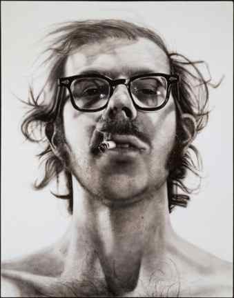
Chuck Close
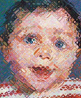
His art is less referred to in my depictions but still an influence in the product. His unique patterns that give a sense of someone's personality are displayed in my final artwork.
Chuck Close is well known for his patterns and self portraits that all have entitled meanings. The patterns that are represented in my final art reflect the mood of the picture and the viewer is able to get a meaning out of the attitude displayed. By adding patterns such as Chuck Close it will add to my explanation of who I am and what I want people to know.
The new photoshop techniques that I am attempting to try are framing, artistic patterns, word stamp, and colorful backgrounds. This website is a great tutorial for the ideas I have:


