
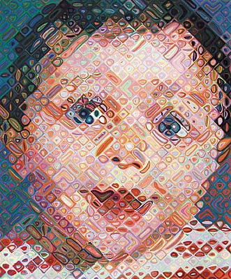
CHUCK CLOSE
http://daddytypes.com/archive/chuck_close_emma.jpg

http://www.tfaoi.com/cm/2cm/2cm646.jpg

http://www.platesandpalettes.com/platesandpalettes/wp-content/uploads/2010/10/bottle-caps-portrait-chuck-close.jpg
Chuck Close appealed to me because I liked the way he displays his art through one image and can make a meaning of a person without to much elaboration. His big ideas that are presented throughout his work are taking a portrait of a family member, friend, or even himself and incorporating a pattern throughout the image to display a mysterious story of that person. His work has inspired me to take a self-portrait of myself and display my identity through my thoughts and to add a simple pattern to my art. A question that came about after reviewing Chuck's art was, why did he generally use such dark colors in his artwork? Was it beacuse these people brought about dark thoughts? Did he not like them or was depression involved? This artist will inspire my final project because I want to incorporate his idea of taking a self- portrait and display more meaning to it with the addition of a pattern that fits my personality. Styles I may choose that are different than Chuck's are brighter colors and focus the image more on what fits my personality in stead of just black and white photos. Also I would like to incorporate some images into the background that are representative of my thoughts and life. Chuck Close's artwork will greatly inspire my final project because I would like to add a pattern to my image and focus mainly on my self- portrait and not so much the background like alot of his artwork.
NEIL DUERDEN

http://io-noi-aldo.sonance.net/blogpix/duerden.jpg


Neil Duerden is a well known photoshop artist that has alot of creative images throughout the media. His art appeals to me because the brightness and background images that are placed within the art all combine to describe the person in the picture. Neil's big ideas are to create photos that have multiple meanings and that are eyecatching to a viewer such as very innovative backgrounds that add more elaborate meanings to his work. His work has inspired me to add a descriptive background to my final project while incorporating the ideas of Chuck Close. After viewing Neil Duerden's work a question that arises is how does he create such complex backgrounds while still keeping the original meaning of the picture alive? My final project will refelect Neil Duerden's due to his inspiration of such creative backgrounds. I would like to make a background in my final depiction that describes me but at the same time does not take away from the ideas of Chuck Close. My artwork will be stronger than Neil's because I want the main focus to be on me and not so much on the background so by using the background to display my identity to a minor extent will help to eliminate the distraction of a complex background.


